I have a passion for older properties and I’m lucky to work in some spectacular Regency and Georgian era buildings. One of the most important aspects in the aesthetic design of these projects is choosing the right colour for period homes.
choosing colour for period homes
Even though my design schemes can sometimes have quite a contemporary feel, I’m always sympathetic to the wonderful history of these beautiful buildings.
I’m often asked what paint colours work best for period homes and here are my top 3 tips
1. check out the surroundings
I know this is a bit of a cliche but my first tip is to take inspiration from the surroundings.
Georgian homes are often blessed with large windows and during the day, the view is the main focal point of a room. In Brighton, the seafront townhouses I’ve been fortunate to work in overlook the coast to the south and the Downs to the north. Therefore I take inspiration from these calming natural shades in my designs. If colours work in nature, they will work in your home!
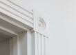
2. highlight those beautiful period details
Period homes often have high ceilings and ornate cornicing / plasterwork. Sometimes I like to keep the walls neutral and paint a complimentary shade (again from nature’s palette) to the woodwork, dado rail and picture rail. Or I sometimes wallpaper the area either above or below the dado rail. The high ceilings can take the drama of stronger colours.
Just remember to check the aspect! South facing rooms can pretty much take any colour though a north facing room will need lighter shades to stop it looking gloomy,
3. inspiration from inside the home
For example, some period homes have the beautiful original marble fireplace still intact so I draw on a tone in the marble to use as an accent (either a paint colour or furnishing). This harmonises the space wonderfully.
Little Greene paints is a great place to look for colours for your period homes. I also love Dulux Heritage.
Do you have a period home needing a re-vamp? Get in touch here